Optimizing Images with Astro (part 2)
Building on the zero-config `<Picture>` baseline from Part 1: eager/lazy split above the fold, LQIP placeholders and a cache-aware fade, pixel-perfect sizing from real layout tokens, and the final combined stack. The sizes contract turns out to be the biggest byte lever — and it flips between mobile and desktop.

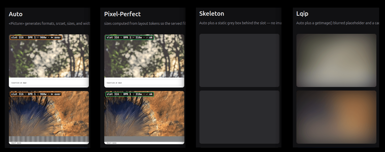
Part 1 landed on a baseline: Astro’s auto <Picture> wins on both mobile and desktop with zero config. But its image sizes aren’t optimal — it under-sizes the big slots and over-sizes the small ones. Four levers stack on top of that baseline: priority hints, a placeholder for perceived performance, exact sizing, and the combined stack.
As in Part 1, the optimg project is the companion demo for every strategy below — each ?debug link points at a live page you can inspect.
Above the fold: eager, lazy, fetchpriority
The first lever for improving auto is dialing in the loading and fetchpriority attributes, as covered in the tactics cheatsheet.
Astro defaults every image to loading="lazy", which is right for everything except the image that is the LCP element. The clearest case is a “hero” image (cover). It should load eager and high-priority; everything else can stay lazy:
loading={type === "cover" ? "eager" : "lazy"}
fetchpriority={type === "cover" ? "high" : "auto"}
fetchpriority="high" tells the browser to fetch the hero image before the lazy images further down. In the naive strategy, twenty-one images fight over bandwidth because none has a defined priority, which explains the 28.9 s mobile LCP (against 3.8–4.5 s for the others, with manual the exception at 6.5 s).
For “list” or “grid” layouts, which show several thumbnails on the page, it’s less obvious — the author decides the priorities.
The approach I use here — split above-fold — is to derive both attributes from each cell’s position. Since the viewport is unknown at build, the best compromise is to give eager to a fixed number of images that are always in the visible part of the viewport, and set fetchpriority="high" on the first element only. If the LCP is lazy, Lighthouse 13 penalizes it (lcp-discovery).
// covers mobile 1-col (3 above-fold) and md/lg 2–3-col (2 rows = 6)
const EAGER_AHEAD = 6;

// index omitted → below-fold
const isAboveFold = (i?: number) => (i ?? Infinity) < EAGER_AHEAD;

const isCover = type === "cover";
const isLCP = !isCover && index === 0;

// eager covers the whole visible area; fetchpriority flags a single element
const loading = isCover || isAboveFold(index) ? "eager" : "lazy";
const fetchpriority = isCover || isLCP ? "high" : "auto";
Where auto falls short: two more paths
Two axes are worth exploring:
- improve perceived performance — fill the empty space while the image loads (LQIP);
- improve the sizes loaded — serve exactly the slot’s size (pixel-perfect).
LQIP: filling the empty space
A “hero” image arrives fast, but not instantly. On a slow connection, a few seconds can pass between “the page appeared” and “the images loaded”, and without a placeholder each slot is an empty box — the page looks broken. This is perceived performance.
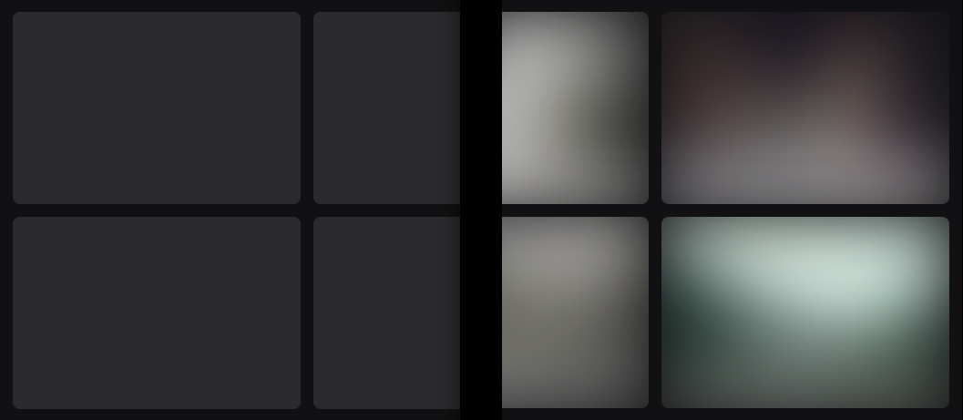
The options form a spectrum, from simplest to most polished. At one end, the skeleton: a solid block of color (zero bytes, zero decoding). At the other, the LQIP: a blurred thumbnail that hints at the final image. In between sit the LQIP variants — a few-pixel image stretched so it blurs “for free”, blur baked in at build or generated on demand, inline SVG or data:uri. I stick to the two ends here, skeleton and LQIP: they’re enough to measure what a placeholder costs.
Server-side, the LQIP is generated at build time. The goal I picked drives the whole implementation: inline the placeholder as a base64 data: URI, so it ships inside the page’s HTML and paints on the very first frame — zero network requests, no round-trip before the slot is filled.
That goal rules out getImage(). getImage() returns a URL to a file that Astro writes in a later build pass — so at the moment my component renders, the file doesn’t exist on disk yet, and a URL is the wrong shape for inlining anyway (I need the actual bytes). So I go straight to sharp over the source file’s real path, exposed by astro:assets as fsPath on the imported image, resize it in memory, and base64-encode the buffer:
const LQIP_SIZE = 32;

async function buildLqip(image: ImageMetadata, plan: RenderPlan) {
  const [aw, ah] = plan.aspect;
  const srcBuffer = await readFile(image.fsPath);
  const lqBuffer = await sharp(srcBuffer)
    .resize(
      LQIP_SIZE,
      Math.round((LQIP_SIZE * ah) / aw),
      plan.fit === "cover" ? { fit: "cover" } : undefined,
    )
    .webp()
    .toBuffer();
  return `data:image/webp;base64,${lqBuffer.toString("base64")}`;
}
sharp is free here — it’s already a dependency, the same library Astro’s own image service uses under the hood. The trade-off is that this runs as a blocking step during each page’s render.
Only the data: URI forces this. If you don’t need the placeholder inline — if a separate small file that costs one extra request is fine — then getImage() is the simpler path: let Astro emit a tiny blurred file and point the placeholder <img> at its URL. Same for the CSS-blur variant below (a real 32px <img> blurred with blur-2xl): that’s a URL too, so getImage() covers it. I chose the inline route because filling the slot before the first paint, with no request at all, is the whole point of the LQIP.
The placeholder sits behind the real image (position: absolute, negative z-index), blurred; the real <Picture> starts invisible thanks to pictureAttributes, which pass props from the Astro component down to the inner <img> element.
<div class="reveal-img relative overflow-hidden">
  <img
    class="absolute inset-0 -z-10 h-full w-full object-cover blur-2xl"
    aria-hidden="true"
    src={placeholder}
    alt=""
  />
  <Picture
    src={img}
    formats={["avif", "webp"]}
    sizes={sizes}
    alt={alt}
    pictureAttributes={{ style: "opacity: 0" }}
  />
</div>
There are several ways to render the blur. At build time with ImageMagick’s -blur 0x8 (or the Sharp equivalent), or on demand — or you deliver a sharp 32px image and blur it in CSS (blur-2xl). Performance-wise, the CSS blur runs on the GPU, off the main thread, and is enough in most cases — except maybe a very large image, where delivering an already-transformed file is more efficient.
Adding a transition
To improve the experience, you can add a transition between the placeholder and the real image. It comes down to swapping the opacities of the placeholder and the image once the latter has loaded. But one detail makes the behavior smart: a cache-guard condition.
const showImage = () => {
  picture.style.opacity = "1";
  if (placeholder) placeholder.style.opacity = "0";
};

// cached → snap, no animation
if (imgElement.complete && imgElement.naturalHeight !== 0) showImage();
else {
  // network → transition
  picture.style.transition = "opacity 1200ms ease";
  imgElement.addEventListener("load", showImage);
}
Animate unconditionally and every back/forward navigation replays a 1.2 s fade on images the browser already has, and the page flickers. Checking imgElement.complete means the animation only plays on a real network load. Astro also offers the astro:page-load event so it survives View Transitions.
And one non-negotiable rule I discovered here: don’t animate the LCP element. A fade is an element render delay: the pixel is painted at opacity 0 then raised to 1 over 1.2 s, and Lighthouse dates the LCP at the end of the animation, not when the bytes arrive. My first version faded the hero like everything else; the final run’s element render delay dropped to 29 ms once the LCP was exempted, against ~1236 ms before.
So the component exposes an ABOVE_FOLD_FADE = false flag. Since the viewport is unknown at build, we don’t know which of the visible images will be the LCP element: the fade is therefore disabled for the whole above-the-fold area (the cover image and the first grid cells), not just the first. Above the fold, images snap; only the lazy images below keep their fade.
The LQIP benchmark
| Strategy | Mobile — bytes (KB) / LCP | Desktop — bytes (KB) / LCP |
|---|---|---|
auto (<Picture>) | 597 / 3789 ms | 716 / 348 ms |
| skeleton | 597 / 3803 ms | 716 / 398 ms |
| lqip | 597 / 3816 ms | 716 / 404 ms |
On mobile, skeleton adds +14 ms to auto (negligible) and lqip +27 ms (decoding the blurred preview). On desktop, the three become equivalent: auto lands at 339–385 ms, skeleton 337–466 ms and lqip 387–488 ms. The +50 / +56 ms in the medians are inseparable from measurement noise. A placeholder weighs almost nothing here. And choosing between a skeleton or a blurred image is a UX decision.
I wrote this fade script twice, and the two versions disagree on the details — which is the useful part:
| Aspect | This site | A comics site I also maintain |
|---|---|---|
| Placeholder | separate 32px blur <img> behind | none — the real <img> blurs over itself |
| Transition | opacity, 1200ms | opacity + filter: blur(10px)→0, 400ms |
| Cache guard | img.complete | img.complete && naturalHeight !== 0 (more robust) |
The guard in the second column is the better one: a cached-but-broken image reports complete: true with naturalHeight: 0, and only the stricter check correctly skips the fade. Same idea, learned twice.
Pixel-perfect: the exact size
The other path is serving exactly the right image size, down to the pixel. It’s fair to ask why bother, when Astro’s auto layout already generates a perfectly reasonable srcset on its own.
This is the one criterion no number can settle: the user’s need, decided by what’s inside the image. Every benchmark below measures bytes and LCP, but whether pixel-perfect is worth it comes down to a question the LCP can’t answer — can this image survive resampling?
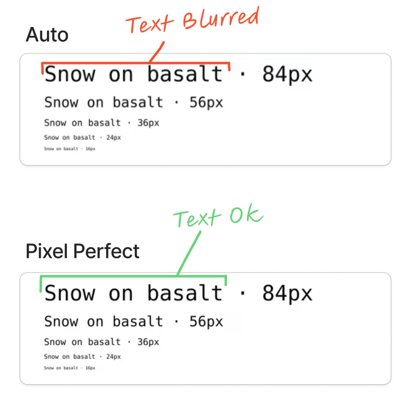
For a photograph, no need. The browser picks the nearest srcset step, scales it by a few percent, and that scaling is invisible — a very slightly blurred tree still looks like a tree.
But there’s one case where the exact size is required: images with fairly small text inside, and maybe images with very fine lines too. I noticed it while working on my humorous comics site https://leconceptdelapreuve.jeromeabel.net. There, if the image isn’t the right size, the browser resamples it: the text turns slightly blurry and harder to read, and thin lines shimmer.
Avoiding resampling
On a periodic grid of lines, the effect turns extreme: the bars shift phase and you get moiré, interference bands that signal a sampling mismatch (Wikipedia: Moiré pattern).
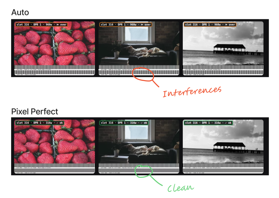
To avoid resampling, CustomImage computes sizes from the real layout CSS tokens — page max-width, padding, gap, the grid:
const sizesAttr = [ `(min-width: 768px) calc((min(100vw, ${pageMaxPx}px) -
${chromePx + gapPx}px) / 2)`, `calc(100vw - ${mobileChromePx}px)`, ].join(", ");
The effect depends entirely on the slot size, and that’s where the benchmark surprises:
| Strategy | Mobile — bytes (KB) / LCP | Desktop — bytes (KB) / LCP |
|---|---|---|
| auto | 597 / 3789 ms | 716 / 348 ms |
| pixel-perfect | 913 / 4523 ms | 222 / 305 ms |
The inversion. On desktop, the LCP element is a 316px thumbnail in the 3-column grid: pixel-perfect serves exactly that size and transfers 222 KB, against 716 KB for auto — a factor of three, for the same AVIF transformation. auto’s generic sizes over-sizes the image with a w=640 for a 316px slot. Here, sizing right is the biggest byte gain in the whole article.
On mobile, the order flips. The LCP element is a full-width image at DPR 1.75, not a thumbnail: pixel-perfect sizes that big slot honestly and transfers 913 KB, where auto shows only 597 KB — but because it under-sizes, serving a file too small for the slot. Lighter doesn’t mean better-sized. The same code produces two opposite rankings, because “well-sized” depends on the slot, not the strategy.
Seeing the gap
To check the sizes contract actually works, every URL in the project accepts a ?debug parameter that attaches a badge per card, showing what the browser really loaded against what the slot required:

verdict: ✓ ok (the file covers the slot at this density), ✗ short (upscaling — a real bug), ≫ over (over-fetch by more than 25%). For naive, the badge shows the full source width with no srcset annotation — the over-fetch is explicit. This is how you verify pixel-perfect works: not by reading the srcset, but by looking at what the browser chose at your viewport and DPR. The overlay requires ?debug in the URL, never present in a clean Lighthouse run.
One variant deserves a note: cropped gets the best mobile LCP (3611 ms). Cropping moves fewer pixels for the same slot width — but it’s a framing choice (crop: true per item in gallery.json), not a standard performance lever, and it’s off by default.
Combining: the final stack
final stacks the four levers: the split above-fold, the LQIP placeholder, the fade exempted on the LCP, and the pixel-perfect widths derived from tokens.
<div class="reveal-img relative overflow-hidden">
  <!-- 32px blur placeholder, at the real image's aspect ratio -->
  <img
    class="absolute inset-0 -z-10 h-full w-full object-cover blur-2xl"
    aria-hidden="true"
    src={placeholder}
    alt=""
  />

  <!-- pixel-perfect <Picture> -->
  <Picture
    src={image}
    layout="constrained"
    width={ppWidth}
    widths={ppWidths}
    sizes={ppSizes}
    height={finalHeight}
    pictureAttributes={{ style: "opacity:0" }}
    alt={alt}
  />
</div>| Strategy | Mobile — bytes (KB) / LCP | Desktop — bytes (KB) / LCP |
|---|---|---|
| pixel-perfect | 913 / 4523 ms | 222 / 305 ms |
| final | 913 / 4534 ms | 222 / 403 ms |
On desktop, final transfers 222 KB — exactly pixel-perfect’s bytes — and its 403 ms LCP layers the LQIP on top of pixel-perfect’s 305 ms, a gap that stays within desktop measurement noise. On mobile, final (4534 ms) is within 0.2% of pixel-perfect (4523 ms): the placeholder and fade weigh nothing measurable once the LCP element is exempt from animation. You get the byte precision of pixel-perfect sizing and the perceived performance of LQIP — the options stack without compounding into a penalty.
What I Learned
- Measure mobile and desktop separately — the results invert. The same
pixel-perfectis the lightest on desktop (222 KB) and among the heaviest on mobile (913 KB), without changing a line. On a single mode, the real lever stays invisible. - The most important criterion is the
sizescontract, not the format — and it cuts both ways depending on slot size. For a desktop thumbnail → sizing right saves 3× the bytes (222 vs 716 KB for the same AVIF transformation). Conversely, for a large mobile image → sizing honestly demands more bytes.autoonly looks lighter because it under-sizes. - Choosing the manual or automatic strategy is decided by the image’s content. Photos tolerate the
srcsetsteps and slight resampling. Text doesn’t: in my case it blurs as soon as it’s resampled, and then you have to compute the exact widths. A periodic grid of lines makes the mismatch visible as moiré. - The eager and lazy attributes are effective, simple levers:
naive(twenty-one eager images with no priority) gets 28.9 s mobile LCP. And native lazy doesn’t promote an above-fold image on its own — on a thumbnail grid, the LCP stays lazy (lcp-discoveryat 0) until the author prioritizes it. - Don’t animate the LCP element. A fade is an
element render delay: Lighthouse dates the LCP at the end of the animation. Exempting the whole above-fold area drops the render delay to 29 ms (against ~1236 ms), andfinalrejoinspixel-perfectwithin 0.2%. Without it, I was measuring the fade’s duration! - Don’t animate a cached image either, or back/forward navigation flickers. Use a robust cache guard with
complete && naturalHeight !== 0. - Placeholder and fade are perceived performance, not a byte gain. On mobile,
skeletonandlqipmatchautowithin +14 / +27 ms (at constant image bytes); on desktop they blur together. They won’t move a Lighthouse score, and that’s fine — it’s a different axis. The skeleton is free; the blur costs a few milliseconds, and only on mobile.