Optimizing Images with Astro (part 1)
From hand-resizing images to Astro and the Netlify Image CDN: what the framework automates for free (AVIF/WebP, srcset, CLS), and how a flawed first benchmark — measuring strategy and deploy pipeline at once — pushed me to a cleaner method where Astro's zero-config `<Picture>` wins the baseline.

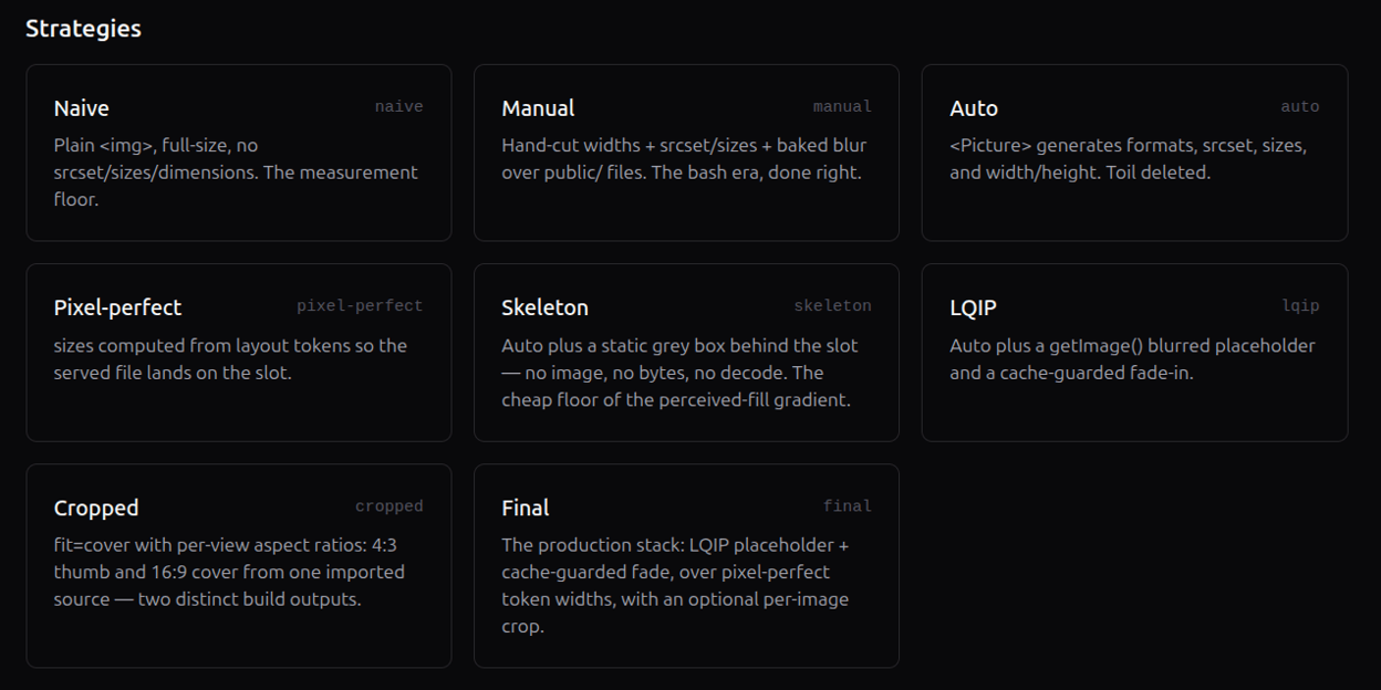
Images are often the heaviest thing your browser has to download. That makes them largely responsible for poor performance scores. Two metrics come up most often for images: LCP (Largest Contentful Paint) and CLS (Cumulative Layout Shift). But they aren’t always enough to pick the best strategy — we’ll see why.
The optimg project serves as concrete examples throughout this article.
The strategies to test
| Strategy | Description |
|---|---|
naive | One version per image, no srcset, no reserved dimensions (width, height). |
manual | Three widths re-encoded by a Sharp/ImageMagick script (quality 78), plus a tiny placeholder image (Low Quality Image Placeholder, LQIP), served statically from /public/. Zero framework, zero lock-in. |
auto | Astro’s <Picture> component with no tuning: modern AVIF/WebP formats, srcset, and sizes generated automatically. |
pixel-perfect | The same <Picture> component, with a sizes attribute computed from the real layout to serve exactly the size of the image’s reserved slot. |
lqip | auto with a low-quality blurred placeholder filling the reserved slot before the full image loads. |
cropped | auto with a per-image crop, reducing the number of pixels transferred for the same displayed width. |
final | The complete optimization stack: pixel-perfect + LQIP + fade animation exempted on the LCP image + above-the-fold images split from the rest. |
First approach: manual — not so naive
You can automate creating and displaying images without a framework at all — just scripts and CSS. It’s a perfectly valid approach. The idea is the same: show the visible images as fast as possible while adapting to the screen’s dimensions.
The basics — a fluid image in CSS:
img {
  display: block;
  max-width: 100%;
  height: auto;
}
A single version of the image often isn’t enough. You need to serve other sizes of the same image to adapt (“responsive”) to the viewport width, the device pixel ratio (DPR), and the page’s various display layouts (thumbnails, hero, grid, columns, etc.). For example, if an image has a 1024px slot available, a screen with a DPR of 2 will want double that — a 2048px image.
In HTML, the srcset and sizes attributes let the browser pick the best-fitting, lightest image to load.
<img
  src="640.jpg"
  srcset="
    640.jpg   640w,
    768.jpg   768w,
    1024.jpg 1024w,
    1280.jpg 1280w,
    1536.jpg 1536w,
    2048.jpg 2048w
  "
  sizes="(max-width: 1023px) 100vw, (max-width: 1536px) 50vw, 768px"
  alt=""
/>
The sizes values have to match your real CSS layout, which the framework can’t infer on its own. In this example, we want the image full-width (100vw) below 1024px, and only half (50vw) on a larger screen — which in our layout maps to a two-column display, capped at 768px. Get sizes wrong and the browser downloads the wrong file, inflating the page load for nothing.
A basic script to generate the various sizes and a blurred version with ImageMagick:
for SIZE in "${SIZES[@]}"; do
  convert "$FILENAME" -resize $SIZE "out/${NAME}_$SIZE.$EXT"
  if [ "$SIZE" == "640x" ]; then
    convert "out/${NAME}_$SIZE.$EXT" -blur 0x8 "out/${NAME}_$SIZE-blur.$EXT"
  fi
done
AI assistants are handy for generating this kind of script. This first strategy isn’t so naive: several image sizes are generated at creation time, served statically, with no dependency on a third-party service.
Second approach: Astro
Astro’s <Picture> component takes over most of the previous work. It generates a <picture> element with one <source> per modern format and an <img> fallback. You just list the formats from most modern to oldest — the order is the display priority.
---
import { Picture } from "astro:assets";
import hero from "./hero.png"; // 1600x900
---

<Picture
  src={hero}
  formats={["avif", "webp"]}
  layout="constrained"
  width={800}
  height={600}
  alt="…"
/>
The layout prop is what lets it generate srcset and sizes. Sample output:
<img
  src="/_astro/hero.hash.webp"
  srcset="…640w, …750w, …800w, …1080w, …1280w, …1600w"
  sizes="(min-width: 800px) 800px, 100vw"
  loading="lazy"
  decoding="async"
  width="800"
  height="600"
  data-astro-image="constrained"
/>
Here width and height are provided explicitly — but if you import the image, Astro can infer them from the source. Either way, it carries them onto the output <img> and derives an aspect ratio that reserves the space before load, which cancels CLS: no unexpected layout shift.
Generate once, or on demand
By default, generating the images needs no server. At build time, astro:assets creates static files with hashed names in /_astro/. That means you can deploy anywhere: GitHub Pages, S3, a USB stick.
Adapters take it further. In the project I use the @astrojs/netlify adapter, which unlocks the Netlify Image CDN. Resizing then happens on demand. For a site with hundreds of images, build time isn’t affected, and the CDN caches the files. Other services are available: Cloudinary, Imgix and others have integrations.
Both options have trade-offs:
- With the static version, two potentially long operations are needed: creating the images at build time and uploading them to the host. In return, when a visitor browses, the server just serves the images — they’re already prepared.
- The on-demand CDN defers the work to the first request: on a cold cache, the server has to fetch the source, decode it, resize it, re-encode it to AVIF, then respond — server compute that adds to TTFB, per image and per cache cycle. The cache is shared: once one visitor fires that first request, the file is cached and everyone after gets it ready-made, until the cache expires or a redeploy invalidates it.
A small Tailwind gotcha
If you’re used to Tailwind, you may hit a problem with the way Astro handles responsive images. To enable them in Astro, add to the config file (docs):
// astro.config.mjs
image: { responsiveStyles: true }, // default false
This injects global CSS rules deliberately low in specificity via :where([data-astro-image]), which still win over Tailwind classes. That makes your Tailwind classes inert. Good to know before spending ten minutes figuring out why object-cover does nothing. The workaround is to use the fit and position props, which plug straight into those same responsive styles:
<Picture src={img} layout="constrained" fit="cover" position="top" alt="…" />The other option is to disable responsiveStyles and take full control of the CSS. As of Astro 6, the responsive styles are emitted as a hashed class plus data-astro-fit / data-astro-pos attributes.
Also good to know: from a single image you can generate two crops (a square thumbnail on the grid, a wide landscape cover on the detail page) with no script:
{/* grid: square crop */}
<Picture
  src={img}
  layout="constrained"
  width={400}
  height={400}
  fit="cover"
  alt="…"
/>

{/* detail cover: landscape, focus on top */}
<Picture
  src={img}
  layout="full-width"
  width={1200}
  height={600}
  fit="cover"
  position="top"
  alt="…"
/>
Choosing: you need a benchmark
To decide which strategy wins between auto and manual, then between the others, you need to measure their effectiveness. The results of my first “benchmark” were noisy, counter-intuitive and unusable — which revealed my method was wrong.
The first benchmark
It ran locally: Lighthouse over netlify serve, desktop preset, median of 3 runs, cold cache each run, on already-optimized picsum sources. I kept only these three lines:
| Strategy | LCP (ms) | Transfer (KB) |
|---|---|---|
| naive | 4876 | 9400 |
| manual | 749 | 962 |
| auto | 1529 | 523 |
What can we read into it? naive is a disaster: 4876 ms LCP, 9400 KB transferred. Basic. But the rest is downright counter-intuitive: manual, which serves a JPEG less optimal than AVIF and twice as heavy as auto (962 vs 523 KB), gets an LCP twice as good. 🙃
The catch: this benchmark measured two things at once.
- Strategy and deploy pipeline.
manualis served statically from disk;auto,pixel-perfectandfinalemit/.netlify/images?url=…URLs and, on first access, the server has to decode, resize, re-encode to AVIF, then respond — compute that adds to TTFB. Andnetlify serveflushes its cache on every launch: the measurement is always “cold”, so the transformation always runs. The 2× gap is that tax, not the format. - The LCP element is a 316px thumbnail, served too wide. The page is a grid of 21 images; the LCP is a 316px thumbnail. At that size, JPEG and AVIF weigh roughly the same — the format gain is invisible. Worse: the
sizesattribute on bothmanualandautomaps that 316px slot to aw=640file — twice too wide.
In short, I thought I was measuring one variable; I was measuring two. I started over from scratch. Which was tedious, I won’t hide it.
The criteria that matter
A single LCP column actually blends four variables, which you have to separate before comparing anything:
- Image bytes delivered. The only deterministic measure — zero variance, insensitive to cache and fade. This is my primary ranking.
- The delivery regime. The only one reproducible on live is the warm one: a throwaway warm-up run primes the edge cache, then a median of 5 measured runs, all on the same deploy (I check every transform URL carries the same
dpl=<deploy-id>, otherwise a redeploy mid-benchmark would have re-cached everything from scratch). - Client rendering. A load fade skews the LCP (see Part 2): I exempt it on above-fold elements.
- The tool.
devtoolsthrottling (actually applied to the network, not the Lantern model that amplifies noise), median of 5 runs — the Lighthouse docs remind us a single run means nothing.
And above all, I measure mobile and desktop separately, from a set of raw originals committed once (Unsplash photos of 3 to 6 MB, resized and re-encoded at build). The first attempt drew its sources from picsum, already optimized before even entering the pipeline — which flattened the very gaps the strategies exist to show.
One criterion remains that no number can replace: the user’s need. A photo tolerates resampling by a few percent; text on an image does not. That’s what determines, upstream, the choice between manual/auto and pixel-perfect — I come back to it in Part 2, in the Pixel-perfect section.
To check hosting’s impact, I re-ran the same benchmark on a static OVH build (files produced by Sharp at build) against Netlify’s on-demand transformation. This is a pass independent of the dual-mode tables below, hence slight differences in bytes (729 vs 716 KB for auto desktop).
| Strategy | OVH LCP (ms) | OVH (KB) | Netlify LCP (ms) | Netlify (KB) |
|---|---|---|---|---|
| naive | 1292 | 9158 | 615 | 9136 |
| auto | 414 | 373 | 412 | 729 |
On the raw payload (naive, ~9 MB, no transformation), only transport matters and Netlify’s edge beats OVH’s single origin by a factor of two: a POP (Point of Presence) close to the visitor crushes a single origin. On optimized assets it’s the reverse: Sharp build-time produces files ~2× smaller than on-demand transformation (373 vs 729 KB), for a near-identical LCP. Hosting can matter, but less than dialing in the sizes values.
The baseline verdict
Let’s cleanly compare the first three strategies with our new method, dual-mode (Mobile, Desktop):
| Strategy | Mobile — bytes (KB) / LCP | Desktop — bytes (KB) / LCP |
|---|---|---|
| naive | 9124 / 28.9 s | 9124 / 605 ms |
| manual | 1148 / 6.5 s | 889 / 375 ms |
| auto | 597 / 3.8 s | 716 / 348 ms |
auto wins on both modes — fewer bytes on mobile, better LCP everywhere, without a line of config. It serves as the baseline for the comparisons that follow.
The devtools lesson deserves an explanation, because it’s what sets the new method apart from the old. By default, Lighthouse doesn’t really throttle the network: it lets the page load at full speed, then simulates a slow network with a mathematical model, Lantern. That model estimates how long each request would have taken — an extrapolation that, on a grid of twenty-one competing images, amplified noise non-linearly and blurred the gaps between strategies. Passing --throttling-method=devtools emulates a Moto G Power on a Slow 4G actually applied to the network layer: every byte really travels at the throttled rate.
The difference jumps out on manual: on a genuinely throttled network, bytes are proportional to time. manual’s 1148 KB become 6.5 s of mobile LCP — the exact opposite of what the first attempt’s simulated throttling suggested, where manual looked far faster.
What I Learned
- The bytes column is the only deterministic one — insensitive to throttling and cache. LCP moves run to run, especially on desktop where close strategies fall into the same noise band. Rank by bytes, confirm with LCP, never the reverse.
- Isolate one variable. My first benchmark measured strategy and deploy pipeline at once, so a heavier JPEG looked twice as fast as AVIF. It was measuring
netlify serve’s cold-cache tax, not the format. - Real throttling beats the model. Lighthouse’s default Lantern simulation extrapolates request timings and, on twenty-one competing images, amplified noise until the gaps vanished.
--throttling-method=devtoolsapplies the limit to the network for real, and bytes become proportional to time —manual’s 1148 KB turn into 6.5 s of mobile LCP. - Hosting matters, but less than
sizes. On the raw payload (naive, ~9 MB), Netlify’s edge beats OVH’s single origin (615 vs 1292 ms) thanks to POP proximity; on optimized assets, OVH’s Sharp static build serves files ~2× smaller (373 vs 729 KB). And sinceastro:assetsproduces static files, it runs just as well on GitHub Pages with no image service — Netlify just moves the transformation out of the build.
That’s the baseline. Part 2 stacks four levers on top of auto — priority hints, LQIP placeholders, pixel-perfect sizing, and the combined stack — and that’s where the mobile and desktop numbers really diverge.