Portfolio
As a front-end developer, I designed and created this portfolio site to provide a great user experience and showcase my ability to build high-quality websites.
| TYPE | Web |
| DATE | |
| STACK | Astro, Hugo, Lektor, Tailwind, Tachyons, W3CSS, JavaScript, CodeIgniter |
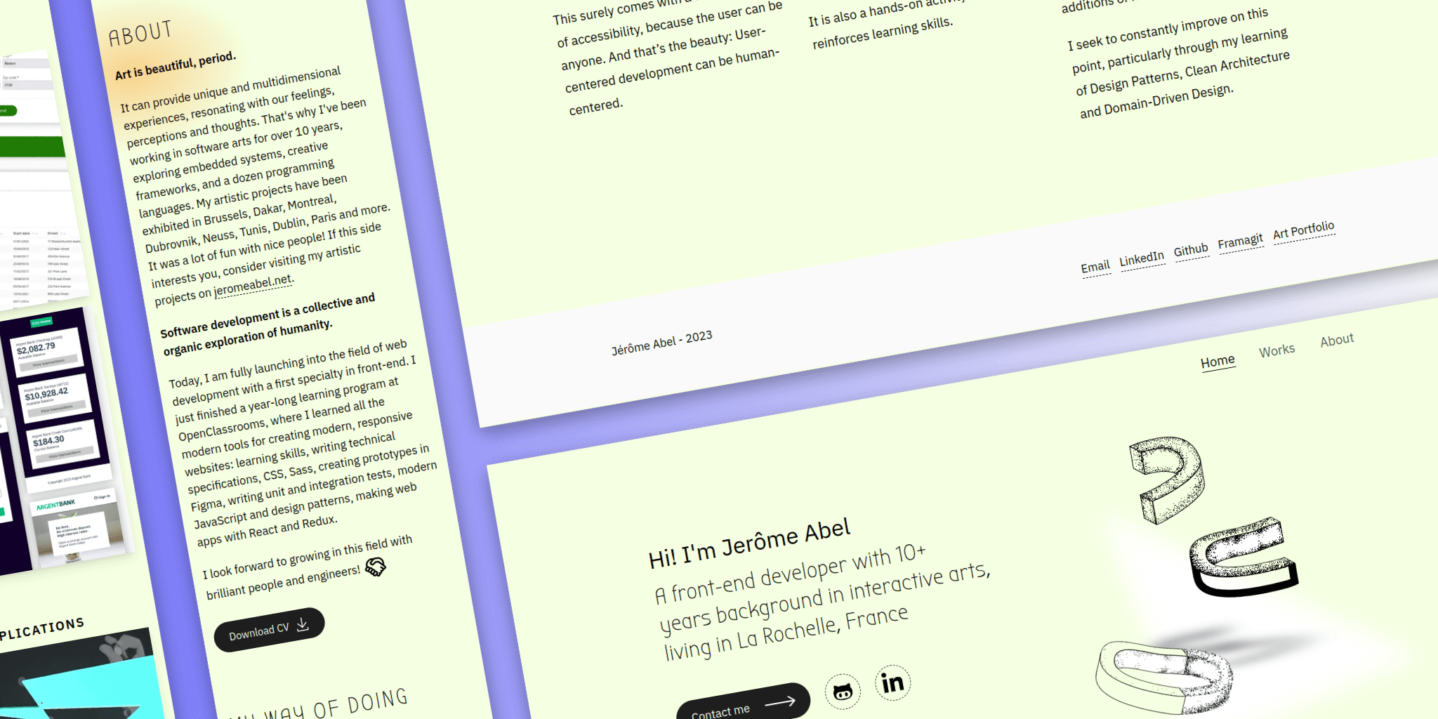
History
Since 2004, I have shared my work on the Web. A portfolio site is always an opportunity to test new techniques:
- 2004: abel.jerome.free.fr: Flash Action Script
- 2012: jeromeabel.net v1: PHP Ionize CMS, Blueprint CSS framework
- 2018: jeromeabel.net v2: Lektor SSG, Jinja template, W3CSS framework, JS slider
- 2021: jeromeabel.net v3: Hugo SSG, Tachyons CSS, JS lazy and scroll
- 2023: dev.jeromeabel.net v1: Astro SSG, Tailwind CSS, JS intersection observer
The problem
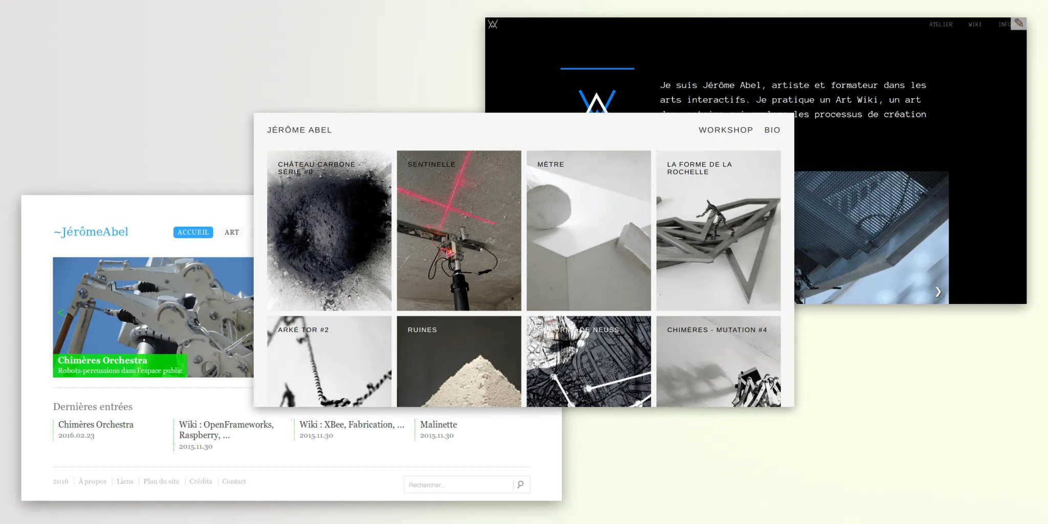
As part of my job search, I need a showcase site focused on web development:
- The github account doesn’t seem to be enough to stand out from other candidates
- My art website doesn’t reflect my new journey into the web development. It could be confusing.
- This should make employers want to meet me
- This should convince other developers to work with me or make interesting connections
The solution
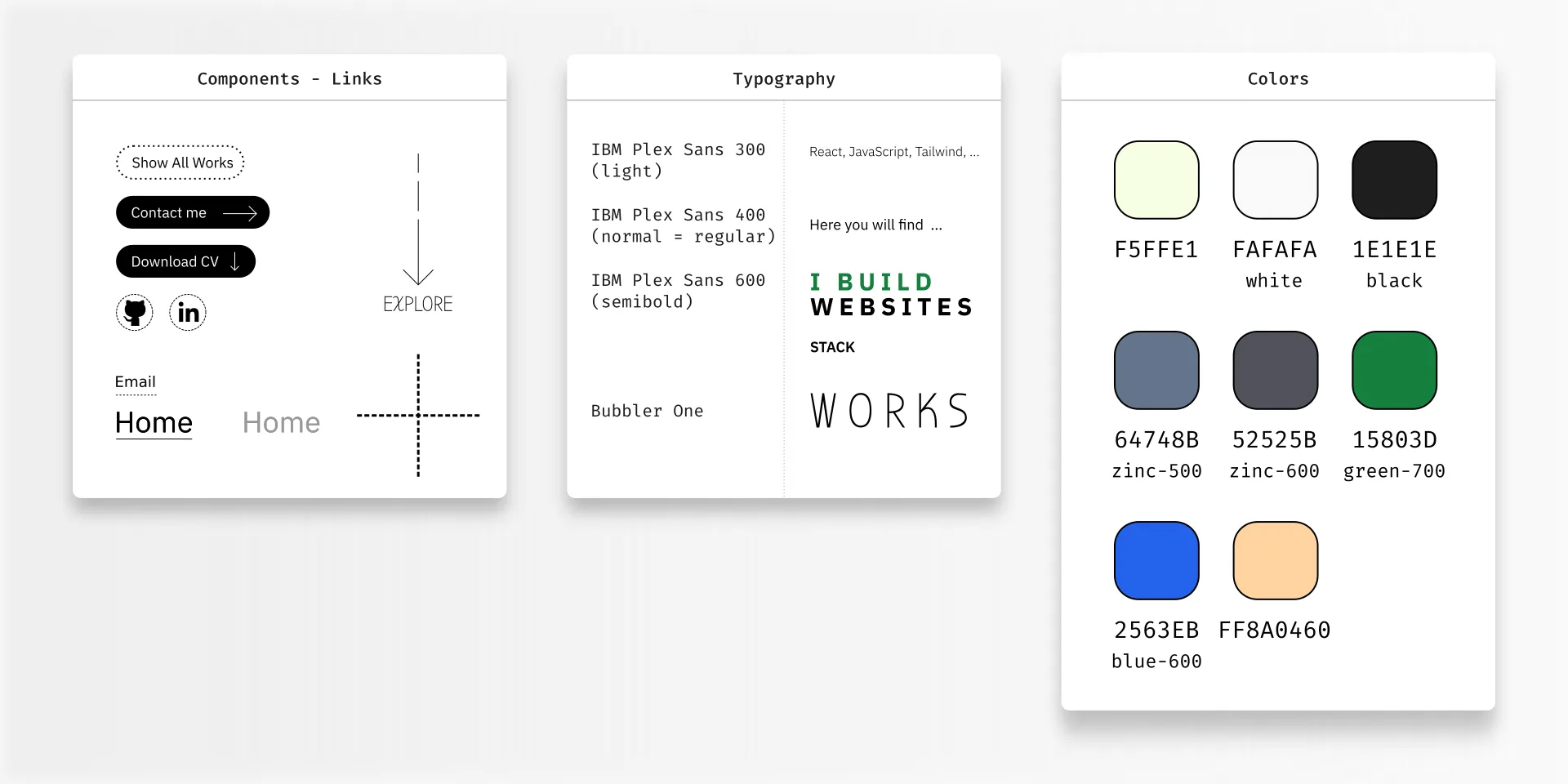
- Create a unique visual identity with Inkscape
- Provide a great user experience with CSS animations and assets loading
- Build a high quality website: performance, SEO, Accessibility
- Share useful content about my works
- Experiment the Astro Framework
Unique visual identity
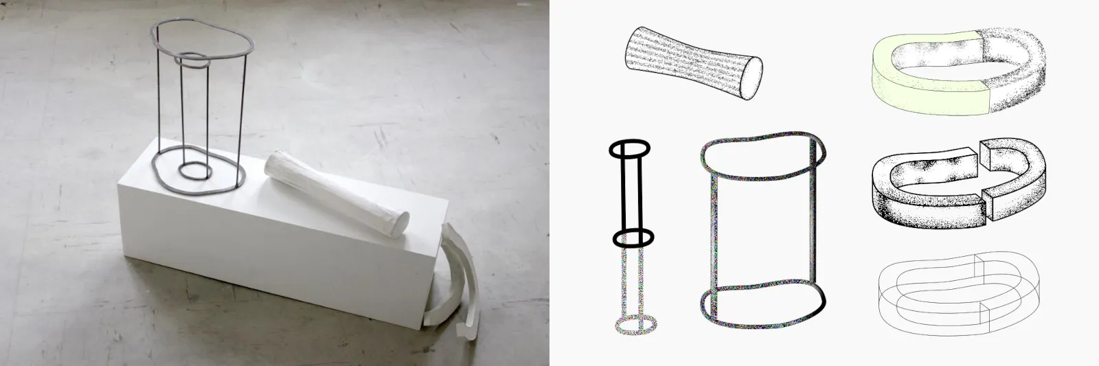
The research on visual identity came from an artistic experience where I took the dimension of my body 1 meter from the ground to construct objects. In real life, these shapes honestly aren’t very interesting, but I still thought it might be a good start for creating visuals for my site.
From there was also born the idea of showing material in a vector drawing: shadows, noises, dotted lines. I wanted to show the idea that my developer profile is not “flat”, that it brings you relief in projects and connections between different points of view
High quality
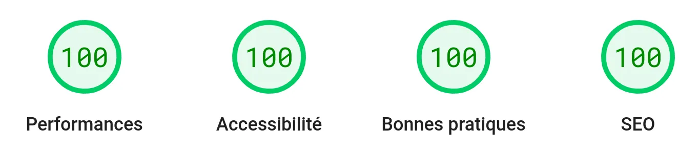
A lot of optimizations have been made to get those great results:
- Font loading
- Responsive images, LQIP placeholder
- Reduce motion
- .htaccess file on Apache server
- Semantic HTML
- …
Intersection Observer
I wanted to add animations when scrolling on the web page. I used the Intersection Observer API to add or remove CSS classes on elements.
The JS script looks like this:
document.addEventListener('astro:page-load', () => {
  const reveals = [...document.querySelectorAll<HTMLElement>('.reveal')];

  if (reveals) {
    // create observer
    const callbackObserver = (entries: any[]) => {
      entries.forEach((entry) => {
        if (entry.isIntersecting && !entry.target.classList.contains('reveal-anim')) {
          entry.target.classList.add('reveal-anim');
        }
      });
    };

    const observer = new IntersectionObserver(callbackObserver, {
      threshold: 0.25,
    });

    // observe boxes
    reveals.forEach((reveal) => observer.observe(reveal));
  }
});
In combinations with these CSS classes:
@media (prefers-reduced-motion: reduce) {
  .reveal {
    opacity: 1;
    transition-property: none;
  }
}

@media (prefers-reduced-motion: no-preference) {
  .reveal {
    opacity: 0;
    transition:
      opacity 1.3s 0.1s ease-in-out,
      transform 1.3s 0.1s ease-in-out;
  }
  .reveal-anim {
    opacity: 1;
  }
  .reveal.reveal-bottom {
    transform: translateY(5rem);
  }
  .reveal.reveal-bottom.reveal-anim {
    transform: translateY(0);
  }
}
What I Learned
- Build a website with Astro
- Work on visual content with Inkscape
- Tailwind tricks
- Optimizations principles
- Use the Intersection Observer API
Articles
I wrote some notes about this work on LinkedIn: